Just got engaged and are starting to plan your wedding? (Or maybe you’re not engaged yet, but just love to plan anyway)! Wedding stationery designs is one of the first things you should be thinking about. Because it doesn’t matter how gorgeous your wedding dress is- if you don’t invite anyone, nobody is going to see it!
To help you discover the perfect stationery for your big day, below are some of my favourite some wedding stationery designs I’ve created over the years. I’ve tried to include a variety of designs to show you how unique your wedding stationery can truly be, and for some serious wedding inspo!
Floral wedding stationery
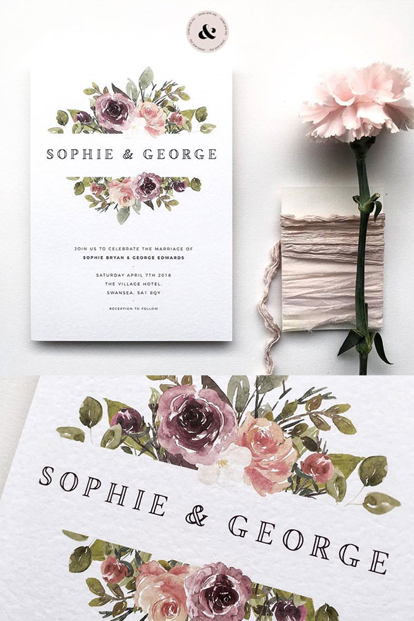
I had to start with this because it’s so popular! Flowers are an essential part of any wedding, which explains why floral wedding stationery is a big hit.
Floral wedding invites are a subtle nod to the wedding day flowers to come. Nothing says chic and feminine like beautiful floral designs.
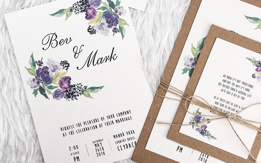
I personally love watercolour flower details; they’re a feminine and chic aesthetic for your wedding stationery design.
Wedding stationery with dark flowers
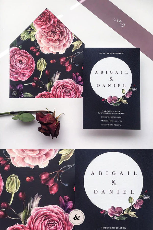
Sometimes brides shy away from the idea of floral wedding stationery, as they think it has to be all pink and girly. But that’s not the case!
Whilst I love working with nude tones, I’ve recently started to create wedding stationery using dark colour schemes. These floral yet dark designs are a feminine yet alternative way to have floral wedding stationery without it being too girly. They emanate sophistication and class, with a slight suggestion of girlishness but not too much femininity.
Blue wedding stationery
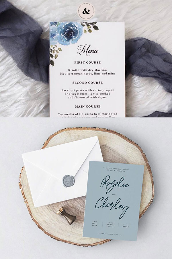
Again, wedding stationery doesn’t have to be pink and girlish shades unless that is what you’re after.
I love creating designs for clients that are after more unique colour palettes, and a colour I think is the perfect compromise between femininity and masculinity is blue.
Although blue is traditionally for boys, some of the most delicate designs I have created used blue as the main colour! Using the right shades and visuals, blue can exude femininity too.
Here I’ve the various shades of blue flowers create a beautiful design that is subtly feminine. But again if flowers aren’t your thing, the write font can also create a girlish vibe but with the blue providing a nice balance.
Wedding stationery with foliage
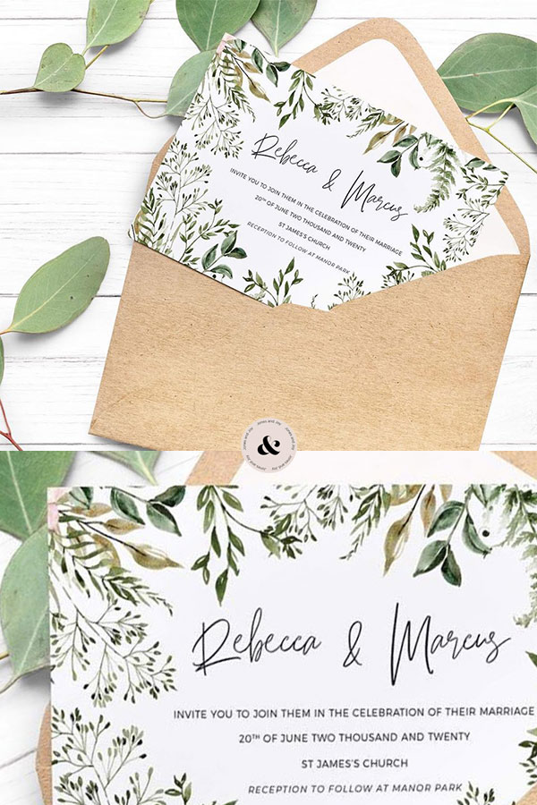
Designs that use foliage are perfect for nature lovers looking for something other than flowers. Again, the watercolours give the overall image subtle layers and depth, and the various shades of green help to give the design a refreshing look.
Line drawing wedding stationery designs
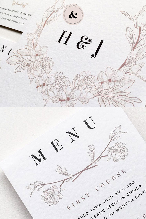
If watercolour designs are too vivid and you prefer something even more subtle, line drawings are the perfect design. They’re more minimalist than watercolour, but the intricate detail provides understated elegance.
And these fine-line drawings do not just have to be flowers. I have previously created illustrations of the wedding venue itself as part of the wedding stationery design, which I really enjoyed!
Minimal wedding stationery
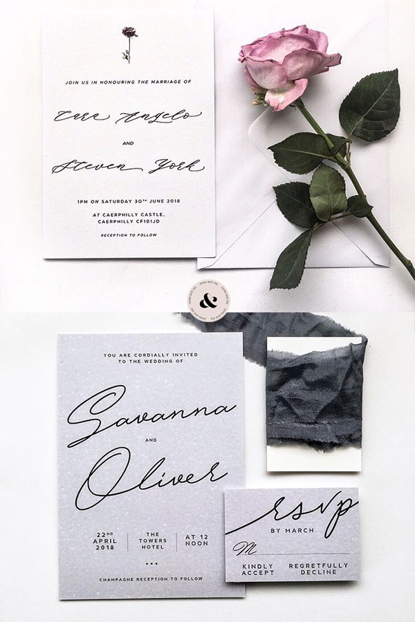
Most of the designs shown so far have included illustrations or imagery of some sort. But minimal designs that feature gorgeous hand crafted script fonts are a simple way to make your wedding stationery look chic.
Although these designs have no imagery, they’re still full of personality thanks to the colour schemes and various fonts available. These are perfect if you have a lot you want to say and need a lot of space for copy!
Monochrome wedding stationery
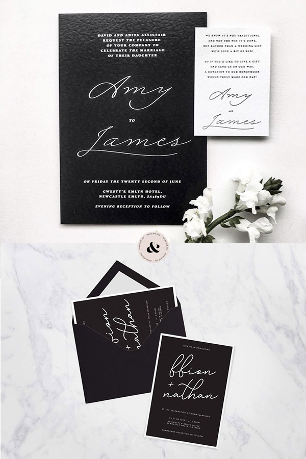
An approach that is even more minimal is to use no colour at all. This stylish black and white wedding stationery conveys class, and is a beautiful alternative if you’re someone who prefers minimalism when it comes to colour.
Black and gold wedding stationery
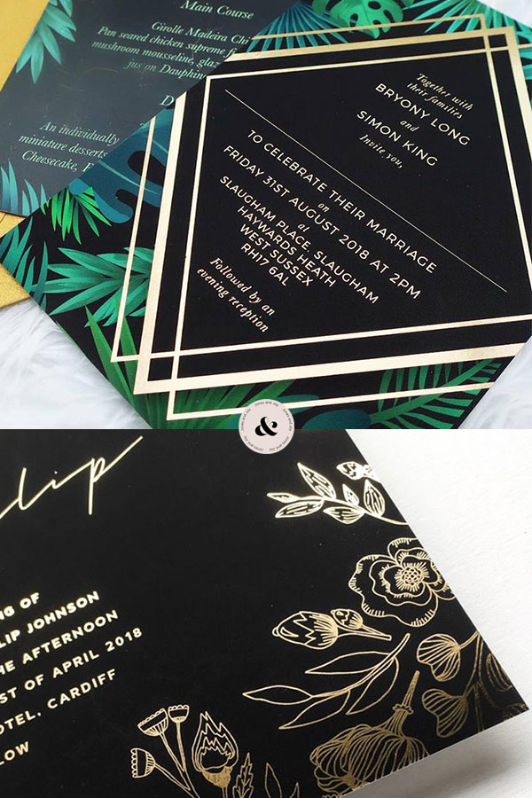
A chic twist on the monochrome colour theme is to use gold accents instead of white. Black and gold is a highly sophisticated colour scheme that oozes glamour, and are perfect designs if you’re after something more original yet still classy.
Foil wedding stationery
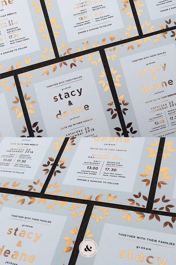
Foil is a beautiful way to add more dimension and texture to your wedding stationery. The various shades of foil available mean it can be tailored to best suit the overall colour schemes in the stationery.
For example, the previous design used gold foiling. But in this one rose gold was more suitable to give the design a warmer appearance.
I love designing foil wedding stationery. I feel that extra detail gives the designs a more sophisticated quality. Plus, it provides an extra surprise for those receiving them!
Photography wedding stationery
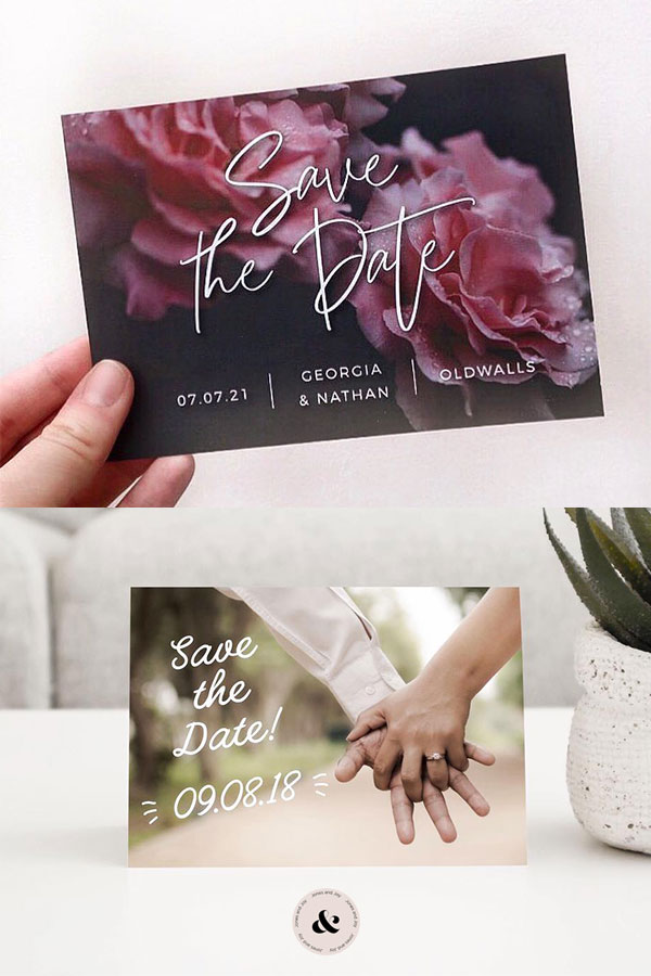
Lastly, a modern stationery concept I adore are ones that use photography.
These can be such personal designs. I previously created a save the date card that featured photography from the engagement shoot. These are seriously unique, and are a great way to show your favourite engagement photographs to friends and family.
That’s wraps up the end of my post! I hope these designs have given you some inspiration for your wedding stationery, and shown you how unique they can be. It’s important for wedding stationery to be designed and created to your needs. Which is why each piece I create is bespoke and tailored to your vision.
I’d love to hear your own stationery ideas, no matter how unique they are! So please get in touch through my contact page, or messaging me on social media.

Recent Comments